Please review the Goodpatch Brand Guidelines before using our logos or other assets. Images may be used only when introducing Goodpatch or as part of an article about Goodpatch.



Guidelines
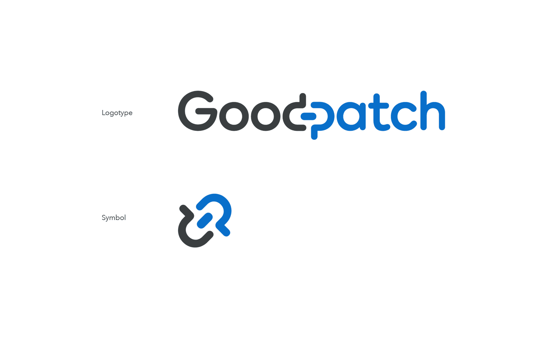
Where
our logo comes from Our name comes from Dogpatch Labs, the San Francisco coworking space where our founder, Naofumi Tsuchiya, had a formative experience—and where Instagram was founded. The word “patch” can mean to connect or join things together. Goodpatch expresses our role in connecting two different things for good, whether people and technology or Japan and the world.
Choosing
the right logo The logotype and symbol may each be used to suit the context, but they must not be combined. Use the logotype when it is important for the company name to be immediately recognizable.

Brand
color The Goodpatch brand color is the vivid blue of the San Francisco sky. When Naofumi Tsuchiya moved to San Francisco with a new resolve, the beautiful color of the sky he looked up at left a lasting impression.
- San Francisco Blue
RGB: 9 111 202
Hex: #096FCA
PANTONE 285 C
CMYK: 85 56 0 0
- Light Blue
RGB: 118 183 237
Hex: #76B7ED
PANTONE 284 C
CMYK: 48 18 0 0
- Midnight Gray
RGB: 58 62 64
Hex: #3A3E40
PANTONE 432 C
CMYK: 0 0 0 90
- Light Gray
RGB: 150 160 166
Hex: #96A0A6
PANTONE 7543 C
CMYK: 0 0 0 45
- Sunset Pink
RGB: 255 118 105
Hex: #FF7669
PANTONE 2030 C
CMYK: 0 68 52 0
- Light Pink
RGB: 255 171 163
Hex: #FFABA3
PANTONE 3572 C
CMYK: 0 40 26 0
- White
RGB: 255 255 255
Hex: #FFFFFF
CMYK: 0 0 0 0
Using
the colors San Francisco Blue: backgrounds and text; Midnight Gray: text; Sunset Pink: accents; White: backgrounds and text. Choose combinations that let San Francisco Blue stand out most clearly. The light colors play a supporting role in shapes and other graphic elements.
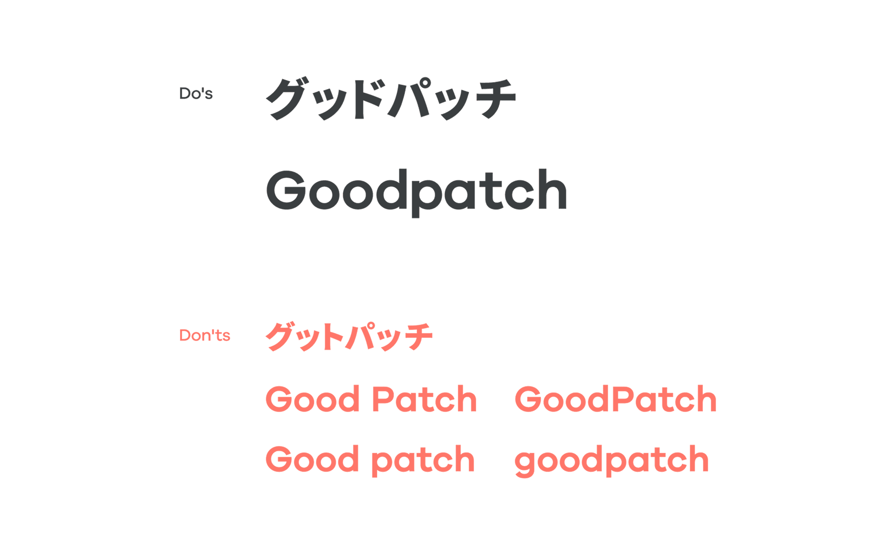
Everyday
name Use either “Goodpatch” in the Latin alphabet or “グッドパッチ” in Japanese katakana. Do not add a space between “Good” and “patch,” and do not capitalize the p as in “GoodPatch.”
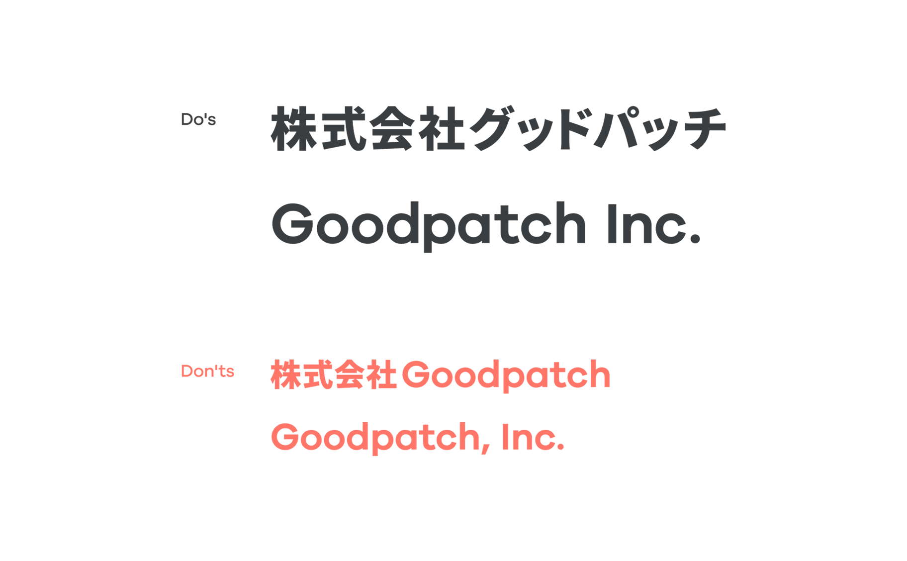
Official
company name When writing the official company name, use either “株式会社グッドパッチ” or the English form “Goodpatch Inc.”


Get In Touch
Talk to us about anything—UI/UX design for services and products, brand building, AI adoption, new business development, or management and business strategy.